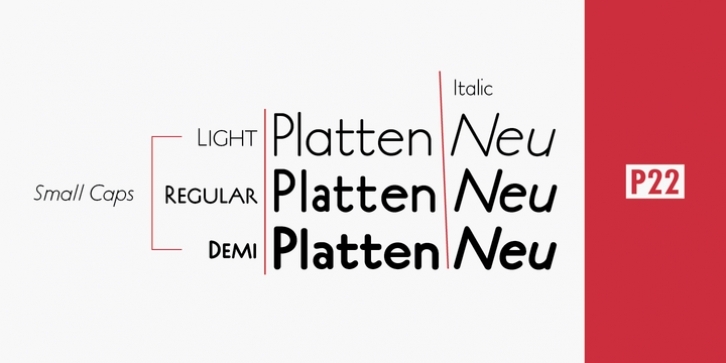
The P22 Platten font family has been revisited and expanded by designer Colin Kahn.
Platten is based on lettering found in German fountain pen practice books from the 1920s (you may have seen the similar Speedball books in the US). This round tip pen lettering is comparable to the basic forms used in grammar school teaching alphabets, but with a few original characteristics. The Italic version has even more of these unusual features.
Geometric and simple yet casual and timeless. Perfect for many uses.

