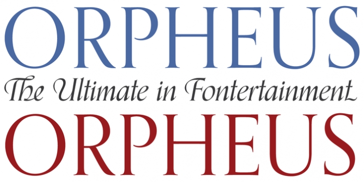
Orpheus Pro was designed by Walter Tiemann, Patrick Griffin, Kevin King and published by Canada Type. Orpheus Pro contains 4 styles and family package options.
The original Orpheus design by Walter Tiemann (1926-1928, Klingspor) was certainly a masterpiece. Unfortunately, like so many typefaces of that between-wars era, it got overlooked when type technology changed over to film, and once again when digital type came around. But during the decade or so when it was available on the metal type market, it was quite popular in Germany. Tiemann was already famous for having an incomparable instinct for the construct and proportions of classic Roman caps, something that shows in spades here, but the surprising genius of Orpheus at the time was how it managed to seamlessly combine an expert vision of the traditional empire caps with a lowercase that showcases a very fine and precise infusion of that efficient rhythm of modern minimalism that was all the rage in Germany at the time, which of course lives on to this very day.
The italic companion to the original Orpheus roman was released in 1936, under the name Euphorion. One reason it never really took off is of course the fact that the war started just 3 years later, so the typeface hadn’t had much time for good exposure. Even so, the Euphorion italic was entirely different than Orpheus in its treatment of standard sources of typographic rules and inspirations. With Euphorion, Tiemann maintained the status quo of the traditional italic minuscules, but added a few distinguishing features to letters like the g, k, t, v, w and y. It was with the majuscules where he went really fancy. Alongside the standard traditional italic set of caps, he designed two extra sets, each moving a notch away from the traditional capitals and closer to formal calligraphy, to a point where elegance is just oozing out of some of the swashed shapes. This kind of exuberant design progression must have been a nightmare for the Klingspor punchcutters and pantographs, as evidenced by some of the print specimens left from back then.
The Orpheus Pro fonts started out as a straightforward revival of Tiemann’s Orpheus and Euphorion. It was as simple as a work brief can be. But did we ever get carried away, and what should have been finished in a few weeks ended up consuming the best part of two years, countless jugs of coffee, and the merciless scrutiny of too many pairs of eyeballs. The great roman caps just screamed for plenty of extensions, alternates, swashes, ligatures, fusions from different times, and of course small caps. The roman lowercase wanted additional alternates and even a few ligatures. The italic needed to get the same treatment for its lowercase that Tiemann envisioned for the uppercase. So the lowercase went overboard, with plenty of alternates and swashes and ligatures. Even the italic uppercase was augmented by (maybe too many!) extra letters. And after the Bold was finished, we just had to do a Medium weight. Orpheus Pro has been a real ride.
But now, looking at the end result with tired eyes and rapidly fluctuating moods, we certainly think it was worth it. There must be a snazzy line about Orpheus playing great music for your eyes, but we haven’t quite formulated it yet. Such epics are hard to come by in fontland.
Each Orpheus Pro font comes equipped with upwards of 1000 characters and is rich with OpenType features and extended Latin-based language support.

