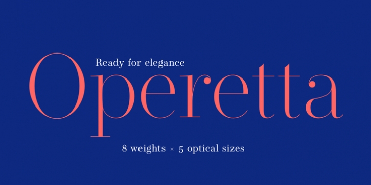
Operetta was designed by Jan Tonellato and published by Synthview. Operetta contains 40 styles and family package options.
Operetta is a neo-didone display font family inspired on Bodoni, Didot (early 18th century) and Walbaum (19th century). Despite of this heritage, Operetta‘s design meets contemporary taste and typesetting needs.
Five optical sizes give you control over the font’s readability on different sizes. Eight weights from Extra Light to Extra Bold let you set your tone: from delicate to exuberant.
Operetta‘s generous character set and opentype features let you meet the most demanding layout needs. And don’t forget swashes, arrows and other extra glyphs (911 per style)!
The number displayed in the font family name represents the minimal size (in points) the style should be used in print design. In web design you should multiply the minimum value by 3/2 for a retina screen; multiply by 2 for a 72 dpi screen. Of course its rendering depends on the printing support, screen resolution, hinting support, etc. Therefore, take it as a suggestion or a starting point; make your own trials.

