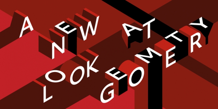
Objektiv was designed by Bruno Mello and published by Dalton Maag. Objektiv contains 42 styles and family package options. The font is currently #45 in Best Sellers.
A New Look At Geometry
Ever since calligraphic letterforms evolved into type, people have tried to rationalize the lines and curves of letter shapes into geometric forms.
As far back as the 15th century, Albrecht Dürer (Of the Just Shaping of Letters) endeavoured to describe a serif with circles and arcs: height to width proportions reference the golden ratio. At the height of the Bauhaus era, with its search for form which follows function, Herbert Bayer and Jan Tschichold experimented with geometry in type and typography. Futura, designed by Paul Renner, is a result of this thinking. But even the designers of these era eventually acknowledged that, for type, form following function is not achieved by geometry but by harmonious proportions.
Objektiv takes a new look at geometry. Its designer, Bruno Mello, followed the principles of mathematical structures but didn’t forget that this typeface is to be used by humans.
What at first glance appears to have been drawn by a compass has in fact been adjusted to account for the way that we perceive the world. The proportions of the characters have not been dictated by geometry and mathematics, but by their harmony with one another, and by what our eyes judge to be right.
Optics is governed by geometry and by mathematics. Lenses, for example, are positioned and adjusted to give specific harmonious ratios of macro or micro. Objektiv, with its three style variants, echoes this principle: for display purposes, Bruno Mello created Mk1, with classically geometric and unforgiving shapes, while for the micro-typographic environment of body copy, where the human simply needs to be able to read the message, Mk3 delivers maximum. legibility. Mk1, Mk2, and Mk3 progressively zoom from macro into micro typography.

