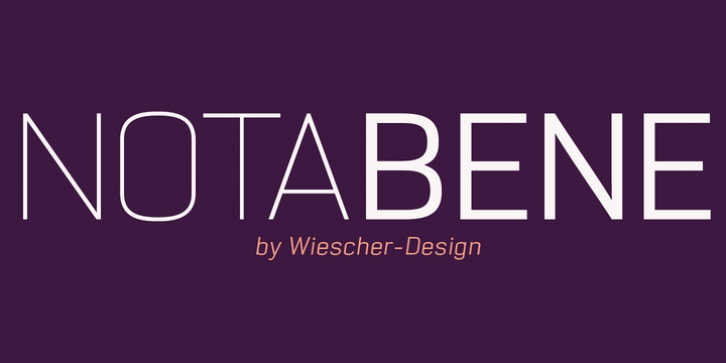
NotaBene was designed by Gert Wiescher and published by Wiescher Design. NotaBene contains 14 styles and family package options.
‘NOTABENE’ is a new, squarish, narrow, technical font– designed by Gert Wiescher in 2015 – has 7 weights with corresponding oblique cuts. ‘NOTABENE’ is well suited for advertising, logo, billboards, small text, signage, branding, packaging, editorial, posters, web and screen design. ‘NOTABENE’ is an OpenType family for professional typography with an extended character set of over 700 glyphs and extensive kerning. It supports more than 40 Central- and Eastern-European as well as many Western languages. Ligatures, different figures, fractions, currency symbols and small caps can be found in all cuts. ‘NOTABENE’ is a sister-font to NOTA. The two fonts can be easily mixed.

