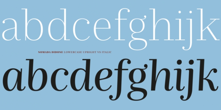
Nomada Didone was designed by Jordi Embodas, MarÃa Ramos and published by Tipografies. Nomada Didone contains 18 styles and family package options.
Designed by MarÃa Ramos and Jordi Embodas, Nomada Didone exhibits a more pronounced contrast than Nomada Serif, with vertical stress and finer hairlines. The contrast amount is not too extreme, though. It’s robust enough to be used confidently also for smaller text sizes, on screen, and in negative settings. The ball terminals add to its posh demeanor – a feature that is particularly noticeable in the gracile Hairline.
At the other end, another exquisite titling typeface: Nomada Didone Extrablack channels the Fat Faces of the 19th century, with adjusted vertical proportions for contemporary use. The medium weights make for a dapper text face that combines clarity and sophistication.

