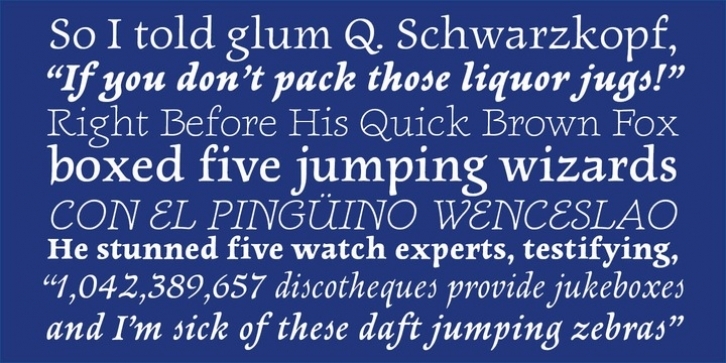
Newt Serif has been described as looking as though it were “drawn by the light of mystic moons”. It’s a very friendly face, with a strong calligraphic bent and no sharp corners to be found. The italics are of a freer spirit than the romans, featuring some intriguingly designed letterforms (for example: ‘E’, ‘g’, ‘s’, and ‘y’). Newt Serif is light-hearted, but still serious and comfortable enough for longer passages of text.

