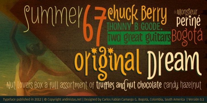
Naturalia was designed by Carlos Camargo Guerrero and published by Andinistas. Naturalia contains 13 styles and family package options.
Naturalia font was designed by Carlos Fabián Camargo in 2012 and suggests an ultra-narrow, spontaneous and winding handwriting lettering, it is great for composing short and striking sentences. His idea behind not only alludes asymmetrical shapes but simple glyphs that compact vertical and tight proportions between lower case and upper case letters. Indeed, lower case letters have ascendant and descendant strokes shorter than the ‘x’ height and width is generally condensed, saving horizontal space and supporting monolinear amount of contrast between thick and thin strokes accompanied by their sans serif endings.
Most importantly, its full and empty arrhythmic areas consolidated variety of thicknesses simulating strokes that seem naive letters freehand draw.This lack of homogeneity is very useful for ranking words and phrases in eye-catching graphic design advertising events, culture, fun and entertainment. In that sense, his spontaneity is enhanced by OpenType features, “Swash” and “Titling” with decorated letters that move your baseline up and down as carousel.
Finally, typographical and naif fusion holding Naturalia concept generates galloping reading useful for ranking short and folk sentences with calibers: Light, Book, Bold and Black. Thus, each “Pro” version has 350 glyphs with some features OpenType Swash, titling and Standard Ligatures. Naturalia also works in software without full OpenType functionality, for that it is recommended to use the remaining options. In order to emphasize the degree of hierarchy and as a special and distinctive feature, the variable Naturalia Black was designed with roundness and slight deterioration contours and also coated frames with zigzag edges that give the impression of black paper cutouts with white letters.

