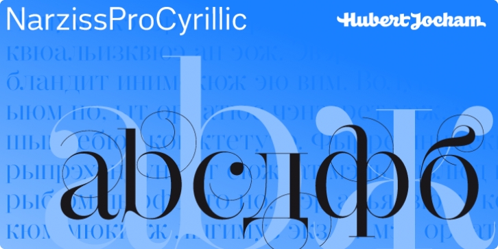
Narziss Pro Cyrillic was designed by Hubert Jocham and published by Hubert Jocham Type. Narziss Pro Cyrillic contains 21 styles and family package options.
Since Mommie, I gradually got more into swirly ornaments. The massive contrast in the neoclassic style is perfect for thin swirly extentions to the characters. Even in an upright typeface. Narziss is very elegant in big headlinesizes. Use it only very big.
What was the inspiration for designing the font? spencerian calligraphies and neoclassic contrast
What are its main characteristics and features? Narziss is very elegant in very big sizes. The Regular version is without any ornament.
The Drops version has some character like the e and the k that are more unique.
The Swirls version has got carefully added swirls, that come out of the basic stroke and
flow into other characters.
Usage recommendations: Big headlines in magazines, brochures and invitations

