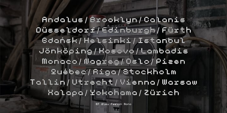
MT Bleu Feelin Mono Font Family was designed by Diki Setiadi, and and published by MametosType. MT Bleu Feelin Mono contains 0 styles and family package options.
MT Bleu Feelin – is a display font with a monospace typographic feel. Please pay attention to Small Caps, Oldstyle Figures, and Alternates. Good for music album covers, posters and magazines. Inspired by the electronic band from Bandung, Bleu House, which has a light and edgy electronic pop experimental music character, the idea emerged to create a font that changes from sound to visual language, namely font.
The use of the design for this font is for Display, and while it is issued one regular weight, in the future will develop multiple masters and other experiments.
The design concept of the MT Bleu Feelin Mono Regular font is to take a 45 degree diagonal and geometric cut technique. also every corner is rounded which gives a dynamic impression like electronic music.
I created this font design because I like visual experiments, and applied it to the character of the font.
By using monospaced font characters have an even width. This is a unique feature in that most fonts are ‘proportionally’ spaced with characters varying in width.
While monospace is perfect in certain ways, it is a proportional font that reigns supreme. Proportional fonts are faster to read. however, the MT Bleu Feelin Mono Regular font is intended for display fonts.
MT Bleu Feelin Mono Regular supports language settings
– Western Europe
– Central Europe
– Southeastern Europe
– South American
– Oceania
– Esperanto

