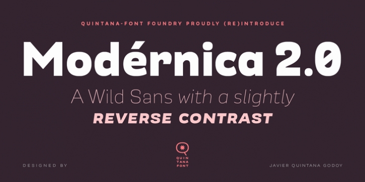
Modérnica was designed by Javier Quintana and published by Quintana-Font. Modérnica contains 18 styles and family package options.
Modérnica was originally published by Latinotype in 2014. Now we (re)introduce a completely reviewed version, under the unipersonal Type Foundry of his author: Quintana-Font.
Modérnica is a sans serif type including roman & oblique styles in 9 weights. At this relaunch, we’ve extended the language coverage and included a new Fat weight, tabular figures, smart fractions & arrows. We’ve improved the OpenType features adding new Stylistic Sets. Besides this, we have retuned the letters spacing in the whole family. Seeking for the best performance, we added a bit of spacing between letters in the text versions (middle weights from Book to Bold), while as for the display variants (extreme weights from Thin to Fat) we made them gain space in the light versions and loose it in the blacks.
Something we didn’t change for sure is the fluid rhythm & friendly structure of this grotesque family. Modérnica is a tool that provides a wide range of possibilities for the design workflow in different formats.
Modérnica is an extension of Mazúrquica (Mazúrquica 2.0 coming soon), a condensed type created for headlines that aim at impact and difference. Based on the Mazúrquica structure, Modérnica was designed as a new typeface for both headlines & continuous text.
‘Mazúrquica Modérnica‘ is a song by the great artist & poet Violeta Parra.

