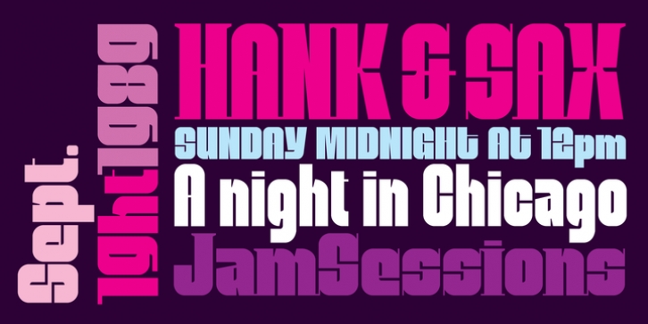
Mobley was designed by Alejandro Paul and published by Sudtipos. Mobley contains 4 styles and family package options.
Based on ten characters found on the cover of a 1960s Blue Note jazz album.
The source characters were originally designed for film-based typesetting by Wayne Stettler as part of a single typeface published by Visual Graphics Corporation (VGC) under the name Neil Bold.
Mobley Sans, along with its condensed and serifed counterparts, constitute a brand new typographic whole molded around the original inspirational source. The family embodies the independent creative spirit of that era – yet manages to remain contemporary with several modern design traits – creating its own unique visual theme through the use of odd counters, generous curves and sharp corners.
Mobley delivers your message in a bold, yet friendly, and subtly discerning fashion. Perfect for music artwork, packaging and book covers.
Available with both sans and serif versions, in regular and condensed widths.

