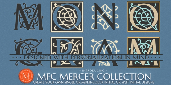
MFC Mercer was designed by Jim Lyles, Brian Bonislawsky and published by Monogram Fonts Co.. MFC Mercer contains 9 styles and family package options.
The source of inspiration for MFC Mercer is an initials set from the book “Monograms and Alphabets for Combination” by Dollfus, Mieg & Cie, first published in the 1880’s.
We’ve taken the original Cameo styled initials that had a somewhat clumsy weighting and rebuilt the design using the capitals from Marcellus Pro by our sister foundry, Stiggy & Sands. We’ve extended the family by including both a Cameo and Non-Cameo version of the Initials, as well as Chromatic versions that can be layered to colorize the designs.
But we couldn’t leave it as just an initial typestyle, so we took it a another step, and created Split Monogram Initials with bar splits & extensions for personalization, with the same chromatic set of layers as the full initials version. For filling in the split, we’ve created a custom limited version of Marcellus Pro, called MFC Mercer Split-TinyCap, that contains small caps, numerals, and basic punctuation – scaled down and lined up to layer with the MFC Mercer Split group of fonts.
MFC Mercer has loads of different ways in which to layer the different fonts in this collection to create unique custom designs. Download and view the MFC Mercer Guidebooks if you would like to learn a little more.
Never before has an initial or split monogram typeface come complete with so many options!

