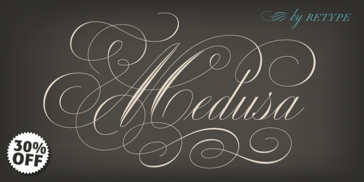
Medusa was designed by Ramiro Espinoza and published by Re-Type. Medusa contains 2 styles and family package options.
Beautiful is Ramiro Espinoza’s homage to 19th Century Catalonian pointed pen calligraphy. The starting-off point in the creation of the typeface was an analysis of the historical models of formal English handwriting and the ways in which those styles had been adapted to the typographic technologies of different eras. A representative example of such adaptations involves the group of letters which, in connected scripts, join from near the top of their x-height, namely “b”, “o”, “v” and “w”.
Up to now, all typefaces derived from the roundhand have been simplified so that the above letters connect with the following glyphs from the middle of their x-height. Unfortunately, this solution produces an artificial, awkward appearance. At ReType we decided to move in the opposite direction. We didn’t force the shape of hard-to-format letters into the service of technology, but rather resolved to press technology into the service of respecting the original graceful quality of those letters.
In addition, numerous elements lacking in Stirling’s book have been added. The fantastically ornate capitals were redrawn in order to strike a greater balance and enhance the consistency of the set of letters as a whole. Several swashes and ligatures were also created from scratch. Perhaps the most unusual feature of Medusa is its small caps, which have been carefully designed to produce an all-cap setting that is stylistically harmonious with the classic copperplate script,

