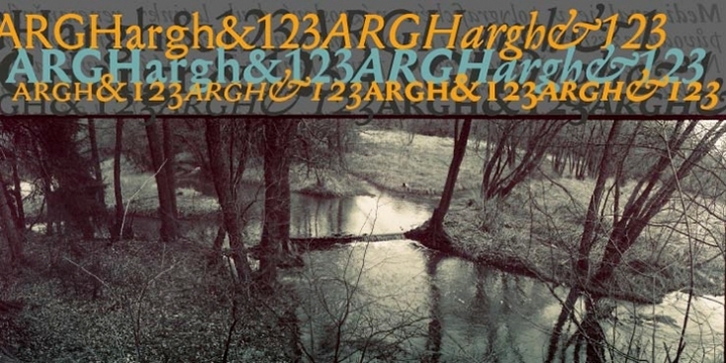
Mediaeval was designed by František Štorm and published by Storm Type Foundry. Mediaeval contains 4 styles and family package options.
Mediaeval in printing terminology means a kind of Roman type face of Renaissance origin with strengthened round shapes; it has nothing to do with the Middle Ages. It follows up the well-tried proportions of Jannon Text. Mediaeval has a robust skeleton covered in soft flesh and its italics still show the Renaissance dynamics.
It is suitable for the setting of very long texts, since it does not contain any sharp points, hairstrokes or other disruptive elements. The darkness of the basic design is 14% of grey, which is frequently regarded as an ideally balanced tonal value of the setting, reducing eye fatigue to a minimum. Its moderate weight encompasses elements of variety and its shading seems to follow a half-moon rolling in the direction of reading. This rhythm considerably speeds up the perception of the text.
Mediaeval has, in addition, been adapted for use in architecture; two memorial plaques on the Old Town Hall in Prague are a proof of this. The inner radius corresponds in details to the arched form of the serifs and makes the production of three-dimensional letters on CNC milling machines easier. It is a “sculptor’s” type face.

