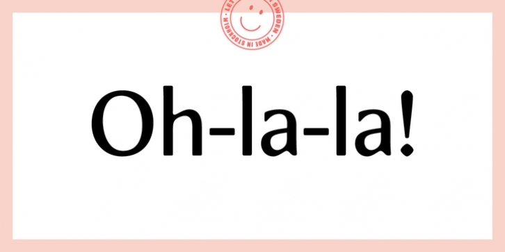
Meadow is a serious attempt to create a neutral typeface family that can also be used as a strong functional typeface for many different needs. At the same time, Meadow has a true personality, which I think new typefaces should have. 
Influences can be found in work by Hermann Zapf, as this style of drawing letters comes naturally to me. I must also confess that I’ve always had a love/hate relationship with his typeface – Optima.
Meadow is the more contemporary alternative with a fresh expression and a twist of something new. What I’m talking about is the movement in the junctions between the stem and stroke which is by purpose shifted away from the stem. This does not really mimic what a broad pen would do, but it gives the typeface some unexpected details.
After making the Meadow family I felt the need to do a slightly more condensed version of the typeface. A version that saves a little space but has the same character. Meadow Condensed works well on its own or as a family member. Character sets are identical, finish and quality is the same, it’s just narrower to make room for more words.
Meadow is well suited for strong headlines all the way down to small size settings.

