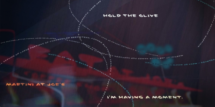
Martini at Joe’s was designed by Steve Mehallo and published by steve mehallo. Martini at Joe’s contains 15 styles and family package options.
Googie Architecture, also known as ‘Midcentury Coffee Shop Modern,’ was born in California during the Atomic Age. Martini at Joe’s is based on lettering from several historic Googie sources – many of which no longer exist.
The futuristic Martini at Joe’s collection was named for Northern California’s famous Italian-themed ‘Joe’s’ restaurants, some of which are still serving up large portions of charbroiled beef steak, canned buttered veggies and pretty decent martinis.
Martini at Joe’s contains many fabulous typographic extras – and is available in single font packages or as a 15 font interchangeable Megaset (with ‘italic-esque’ obliques and ‘retro obliques’).
Martini at Joe’s is perfect for use as commercial signage, on the menu for your coffee shop, supper club, tiki bar, fish grotto, smorgy, space port or destination casino.
It also holds its own in any vintage store, on greeting cards, t-shirts, hi-brow gallery announcements, product skins, your ‘zine masthead, on the faceplate of your futuristic microwave oven, tv dinner packaging, at millionaire’s conferences or even embellishing the fuselage of your latest jet airline venture.
Martini at Joe’s: there’s no better way to say, ‘Hold the olive, I’m having a moment.’

