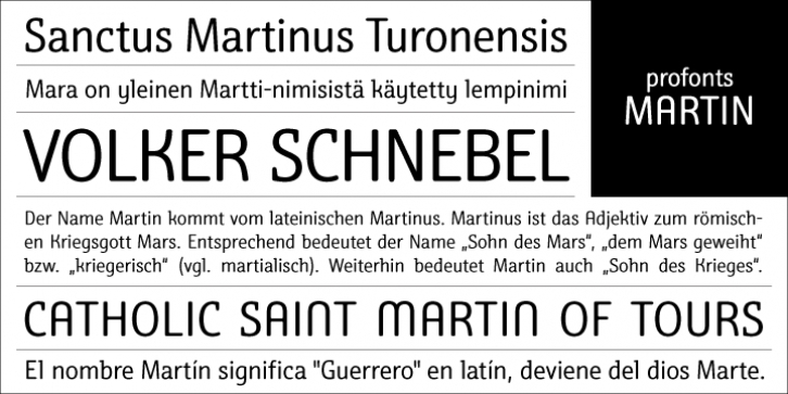
Martin was designed by Volker Schnebel and published by profonts. Martin contains 1 style.
Martin, a condensed semi-serif with rounded edges and friendly serifs, shows its charm best in short, pointed sentences, and in headlines set in about 20 to 36 point.
The playing with serifs in a condensed, very characteristic type design is attractive and the technical skill is convincing. The idea was to try to apply a given design approach (also see Volker Schnebel’s Marita and Manuel fonts) to every single character. In other words, start with a character and develop all of the others from it. This is quite easy for some characters but extremely difficult for others. This process generates creativity and the characters move away from the initial constructed sketch.
Together in a typeface, the individual characters are now all of a piece and character.

