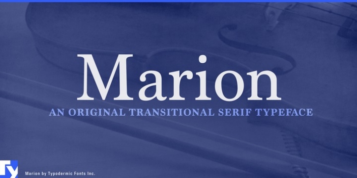
Marion was designed by Ray Larabie and published by Typodermic. Marion contains 4 styles and family package options.
Marion is an unambiguous transitional serif typeface with an eighteenth century flair. It has the general structure of Century Roman with a stroke treatment that’s closer to Baskerville. One of its unique features are the hammer claw serifs of the round capitals. While there are no specific influences for this design, it was created with a general idea of rustic Canadian pseudohistoricism. Marion comes in Regular, Italic, Bold and Bold Italic. Old-style numerals and standard f-ligatures are included. There are also some eccentric discretionary ligatures and some blithe swash letters. Almost all current Latin alphabet based languages are supported as well as Greek and Cyrillic.

