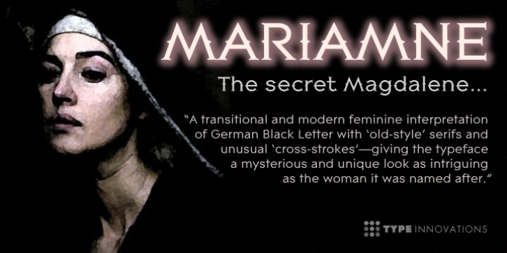
MARIAMNE was designed by Alex Kaczun and published by Type Innovations. MARIAMNE contains 1 style.
MARIAMNE is an original design by Alex Kaczun. It is an elegant, modern and traditional interpretation based on and modeled after his successful ‘Contax Pro’ and ‘New Age Gothic’ typeface series. As such, it has generous proportions with clean, crisp lines-ideally suited for easy reading and long lines of copy.
Alex felt that the skeleton for ‘Contax’ was perfectly suited to transform the design into a modern version of ‘old-style’, somewhat reminiscent of German Black Letter. Numerous modifications where made to the body proportions, stems and shapes. True ‘old-style’ serifs and unusual ‘cross-strokes’ where added for a touch of distinction. The ‘cross-strokes’ where added at exactly visual mid-point on the overall heights. This gives the typeface a romantic, female-like quality to the overall design. Strong, yet delicate. Visually stimulating in appearance and function. The result is a truly unique transitional and modern design.
Unlike other typefaces, MARIAMNE incorporates uniform stems throughout the capitals, lower case and figures. This gives the design a uniform appearance in overall color and strength. There is a perfect visual balance between inter-letter spacing, stem weights and proportions. The accents are equally large, bold and command attention. This font includes a large ‘Pro’ character set, which supports most Central European and many Eastern European languages. As a result, the design is ideally suited for display copy as well as text composition. In the near future, Alex plans to expand the typeface series to include a light and heavy weight, along with true italics.

