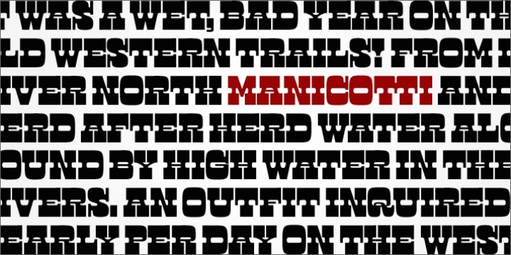
Inspired by the boisterous wood types of the nineteenth century, Manicotti pushes the reversed-stress French Clarendon style to its decorative extreme. Its thick tops and bottoms and massive slab serifs overtake the short vertical stems, creating an oddly dense typographic texture.
Originally drawn as an all-caps poster face, Manicotti was honored by the Type Directors Club in 2007. Ross revisited the design a couple years later, adding lowercase, extended language support, alternates and ornaments. The result is a contemporary take on a rambunctious style, reminiscent of Spaghetti Western films, rugged trails and rowdy saloons.

