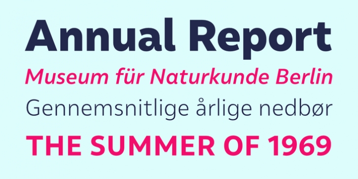
Malva was designed by Henrique Beier and published by Harbor Type. Malva contains 20 styles and family package options.
Malva was designed to perform as a branding element, providing a clean look for visual identities and publications. It brings a touch of friendliness to the communication without compromising the professional look every brand strives for.
Legibility was one of the top concerns during the development of Malva. We took special care to differentiate the naturally ambiguous characters I, i, l and 1. Besides that, carefully proportioned letterforms make Malva a very legible text typeface. The lighter and bolder weights look great at large sizes, such as posters, ads and headlines. On the other hand, the whole family works very well on the web and on mobile devices.
In version 2.0, we added variable fonts, alternate glyphs, tabular figures, superior/inferior figures and arbitrary fractions. All this to make Malva even more versatile.

