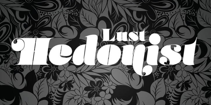
Lust Hedonist was designed by Neil Summerour and published by Positype. Lust Hedonist contains 4 styles and family package options.
Check out the new Lust Pro & Lust Pro Didone to see how the series has grown and evolved.
Confident, voluminous and versatile, Lust is an exercise in indulgence-an attempt to create something over the top and vastly useful.
Lust Hedonist pushes contrast almost to the limit. The letterforms, especially the Script style are very self-indulgent for me, dare I say Hedonistic, and how I like to see letter masses taken to extreme contrast. The series unapologetically channels Herb Lubalin, but produced with a deliberate, contemporary twist. There is an intentional slyness infused in the letterforms-the extreme thick and thin lines flow effortlessly without becoming gratuitous. It’s always just enough, not too much. What makes the type series so appealing? The curves. When asked to describe the letterforms, most people unwittingly allude to the human form, using adjectives usually reserved for describing physical traits… creating all-too-familiar comparisons. Summerour has grown to accept this as unavoidable and reasonable given his acknowledgement of its influences and has provided nuances within the letterforms to accentuate that.

