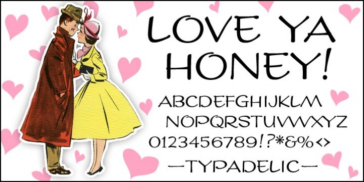
LoveYaHoney was designed by Ronna Penner and published by Typadelic. LoveYaHoney contains 1 style.
Aw, aren’t they sweet? This lettering is based on a 1950s note a husband wrote to his wife shortly after they were married. His beautifully controlled and strong handwriting knows no lowercase characters; he gets his point across in uppercase only.
In today’s world of email and internet writings, we know that uppercase means shouting and is considered quite rude, but he didn’t know that when he wrote this letter to his lovely wife! Love Ya Honey is very legible and looks beautiful when used for headlines, titling or even long expanses of body copy.
Perfect for scrapbooking too!

