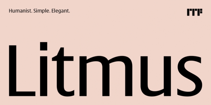
Litmus was designed by Satya Rajpurohit and published by Indian Type Foundry. Litmus contains 5 styles and family package options.
Litmus is the newest typeface from ITF founder Satya Rajpurohit. It is a slightly condensed humanist sans serif design, with a tall x-height and strokes that end with either horizontal or vertical terminals, instead of diagonals. Ascenders rise noticeable above the tops of capital letters, while the fonts’ numerals are slightly shorter than the caps. Litmus‘s interior counterforms are rather open. There are five weights on offer: the Light is monolinear, but the stroke-contrast grows with every weight. The amount of contrast in the Bold is quite high. Each Litmus font makes use of a double-storey ‘a’ and single-storey ‘g’. The fonts may be put to excellent use for text on websites, or in print – especially in documents where a little space-saving is necessary.

