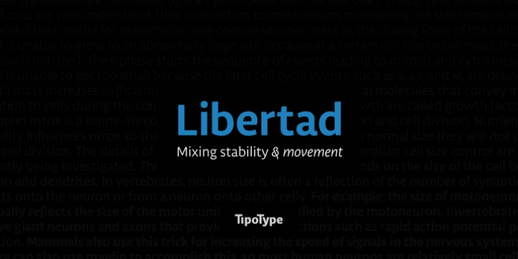
Libertad was designed by Fernando DÃaz and published by TipoType. Libertad contains 14 styles and family package options.
Design can do without images, but not without typefaces.
Libertad is a sans-serif typeface that mixes humanist and grotesk models. It’s most interesting feature is the combination of balanced regulars with dynamic italics, which makes it a very versatile font for different uses.
This typeface follows the Luc(as) de Groot’s Interpolation Theory, that’s why it has seven specially-calculated weights plus their matching italics, from thin to extra-bold. This allows it to be useful in big headlines and also small texts. It has more than 800 characters per weight and support for more than 70 languages.
WARNING: This does not work with most Office suites; you only have access to R/I/B/BI.
Credits: Photos by Lu-Lee.com – Web template by EleganThemes.com

