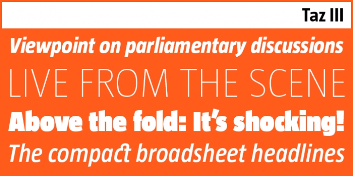
LF Taz III was designed by Luc(as) de Groot and published by LucasFonts. LF Taz III contains 30 styles and family package options.
The Taz type family was originally developed as a headline typeface for taz – short for Tageszeitung – a nation-wide German daily. It was, and still is, the cornerstone of the paper’s strong, trustworthy visual identity. Says Luc(as): ‘For a headline font, you want the lines to be as closely line-spaced as possible. The accents on the capitals – a very common feature in German – cannot take up too much space.’ Ascenders and descenders were kept short for maximum impact.
Although the Taz family was designed as a newspaper font, it works equally well in many other contexts. It has been used in glossy magazines, sales catalogues and corporate brochures, and is appreciated for its readability when used for longer texts in medium sizes.
Since its inception, the Taz typeface has steadily been expanded. The current version, Taz III, comes in a staggering range of 15 weights, including a large series of distinctive hairline fonts and an UltraBlack for maximum impact on giant posters and in magazine headlines.
The current OpenType version includes character sets for dozens of languages including special sets for Central European, Baltic, Icelandic and Turkish.

