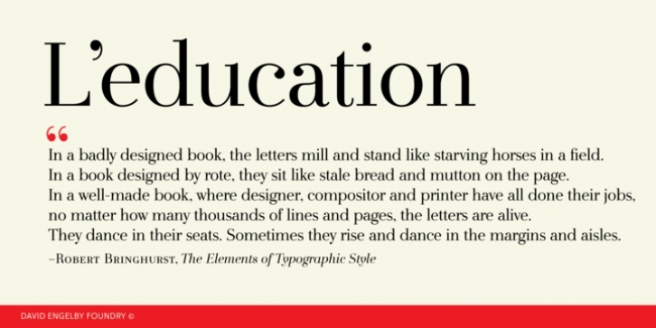
Go ahead, and call it a rational serif. After all, L’education owes its basic style to the neoclassical typefaces like Bodoni and Didot. But it’s more than simply a rational approach – L’education is pure love for a classic expression of elegance (combined with a touch of European decadence, I mean, who needs Le Corbusier all the time?).
L’education is a tailor made text font for those of you who crave elegant typographic design. Elegantly spice up your reports, your book layouts, your posters and many other designs – without sacrificing legibility or contrasts. Mix and match regular, book or bold versions along with their italic styles. L’education also comes in small caps, swash options (for italics), ligatures, Eastern European diacritics, dingbats and many other oldies but goodies for creative variety.
And just for the sake of it, shall we call it l’art pour l’art idealism, L’education is a completely free font – go grab it!

