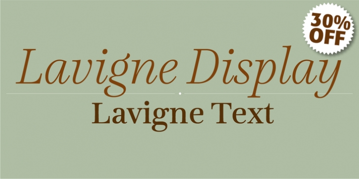
Lavigne was designed by Ramiro Espinoza and published by Re-Type. Lavigne contains 10 styles and family package options.
Lavigne is a type family that is aimed at publications such as interior design and women’s magazines-anywhere a touch of distinction is desired. In the opinion of its designer, glossy magazines have been boring us with the same type families for years, with only a small group of fonts being used to denote refinement and sophistication.
The philosophy behind Lavigne is to achieve the high contrast and other refinements observed in classic modern serif typefaces, without borrowing too much from history. Accordingly, the main source of inspiration was careful observation of pointed-pen calligraphy and sketching.
Lavigne Text is a 4-weight package optimized for ease of reading at small sizes. It features generous x-height, short ascenders and descenders, open counters, and simplified details that improve its reproduction at small sizes.
Lavigne Text also has a solid presence on paper, and its typographic color make it ideal for the setting of fine books and magazines.
The ten distinct styles in Display and Text versions are available in OpenType format, which feature small caps and four sets of numbers (proportional old style, tabular old style, proportional lining, and tabular lining) as well as matching currency symbols.

