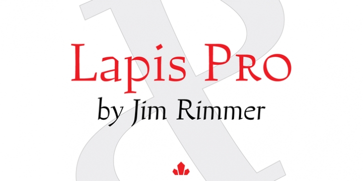
Lapis Pro was designed by Jim Rimmer and published by Canada Type. Lapis Pro contains 6 styles and family package options.
Lapis was Jim Rimmer’s venture into a territory he’d earlier explored with his Lancelot and Fellowship faces. This time he stayed much longer, dug pretty deep, and had plenty of fun in there. The end result is the kind of mosaic of influences only a guy like Jim could consider, gather, manage and apply in a way that ultimately makes sense and works as a type family.
On the surface Lapis seems like something that can be billed as what Jim would have called an ‘advertising text face’. But under the hood, it’s a whole other story. On top of the calligraphic, nib-driven base Jim usually employed in his faces, Lapis shows plenty of typographic traits from a variety of genres, from Egyptian to Latin, from blackletter angularity to Dutch-like curvature, with an overall tension even reminiscent of wood type. There are some Goudy-informed shapes that somehow fit comfortably within all this. Then it’s all strung together with a mix of wedged, tapered and leaning serifs, placed with precision to reveal expert spontaneity and a great command of guiding the forms through counterspace.
In the fall of 2013, the Lapis fonts were scrutinized and remastered into versatile performers for sizes large and small. The three weights and their italic counterparts have been refined and expanded across the board to include small caps, alternates, ligatures, ordinals, case-sensitive forms, six kinds of figures, automatic fractions, and a character set that covers an extended range of Latin languages. Each of the Lapis Pro fonts contains over 760 glyphs.
For more details on the fonts’ features, text and display specimens and print tests, consult the Lapis Pro PDF availabe in the Gallery section of this page.
20% of Lapis Pro‘s revenues will be donated to the Canada Type Scholarship Fund, supporting higher typography education in Canada.

