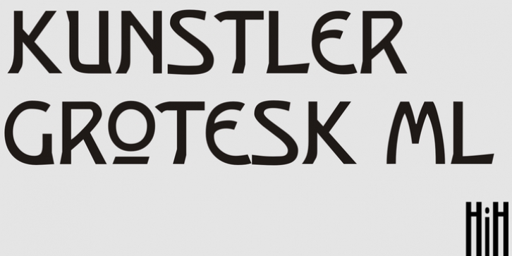
Kunstler Grotesk was published by HiH. Kunstler Grotesk contains 1 style.
Künstler Grotesk ML is one of a number of typeface designs that attempts to reconcile Germany’s blackletter tradition with the international familiarity of roman letterforms in a simple, robust design suitable for meeting the demands of a modern industrial economy, while rejecting the extraneous ornamentation of the departing Victorian era. It is an all-cap design with a number of playful ligatures. It has an appealing boldness that reverses well. Künstler means ‘artist’ in German. I had always assumed it was a person’s name until I came across the translation. Lesson: conjecture is not fact. Grotesk refers to a sans serif letterform tradition.
Kunstler Grotesk was originally released by Bauer’sche Giesserei of Frankfurt am Main circa 1900.
Künstler Grotesk ML represents a major extension of the original release, with the following changes:
1. Added glyphs for the 1250 Central Europe, the 1252 Turkish and the 1257 Baltic Code Pages. Added glyphs to complete standard 1252 Western Europe Code Page. Special glyphs relocated and assigned Unicode codepoints, some in Private Use area. Total of 350 glyphs, 260 kerning pairs.
2. Added OpenType GSUB layout features: pnum, salt, dlig (19) and hist.
3. Revised vertical metrics for improved cross-platform line spacing.
4. Redesigned mathematical operators.
5. Included tabular (std) & proportional (opt) numbers.
6. Refined various glyph outlines.
7. Made CcNnOoSsZz-kreska available (salt).
8. Incorporated alternate glyphs in lower case.

