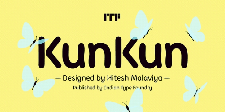
KunKun was designed by Hitesh Malaviya and published by Indian Type Foundry. KunKun contains 3 styles and family package options.
KunKun is a ‘handwritten sans’ – each letter looks as if it has been written with a single monolinear stroke, and its letters’ terminals are fully rounded-off and almost sausage-shaped. Three weights are available in the family, and each font each contains 406 glyphs. Standard-looking variants of g, y, and z are available via an OpenType feature in a Stylistic Set, and there are two alternate forms for the capital Q, and an optional closed-form 8 there, too, even though the default looped-descenders on the lowercase g, y, and z strengthen KunKun‘s informal appearance. Despite KunKun‘s informality, visible in its default character-forms, its basic proportions are in keeping with many of ITF’s text faces. For instance, its design features a large x-height and ascenders that rise above the uppercase letters. Special characters like the &, @, and § also all take typical typographic forms.

