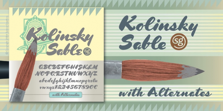
Kolinsky Sable SG was designed by Jim Spiece, Charles Bluemlein and published by Spiece Graphics. Kolinsky Sable SG contains 2 styles and family package options.
Here’s what happens when you use a fully-loaded Asian mink Kolinsky brush to imitate an old script letter style of the World War II era.
Originally published in 1944, Charles P. Bluemlein’s enchanting design has the same bounce, warmth, and charm found in many old magazines and movie titles of that period. Two digital versions are provided in the set. Kolinsky Sable Heavy with Alternates retains Bluemlein’s original heavy, contrasting capital letters. However, some modifications, such as less severe slanting and looser letterspacing, are also present. You will find this version very helpful when setting in small sizes.
If you prefer the tighter, brush-lettered look of the times, try Kolinsky Sable Two Heavy. Caps are somewhat lighter making for generally better color overall. This version is ideal for headlines and logos. Alternate capital and lowercase characters plus an alternate set of small numbers have been provided. Fine-tuning is possible since many lowercase characters are interchangeable.
Kolinsky Sable Heavy and Kolinsky Sable Two Heavy are now available in the OpenType Std format. Some new characters have been added to these OpenType versions including stylistic alternates and historical forms. These advanced features work in current versions of Adobe Creative Suite InDesign, Creative Suite Illustrator, and Quark XPress. Check for OpenType advanced feature support in other applications as it gradually becomes available with upgrades.

