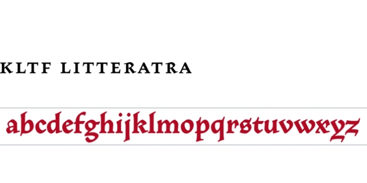
The idea was to make a typeface which creates a dark text block on the page, therefore combining elements of fraktur and roman type. And like with early italic types, Litteratra’s italic lowercase are accompanied by roman uppercase. This suggested to include italics in the regular font.
With a set of italic lowercase, small caps, spaced uppercase, titling uppercase, with standard and discretionary ligatures, contextual alternates, with oldstyle and lining numerals, both proportional and tabular, with superiors, inferiors and arbitrary fractions (more than 1900 glyphs), Litteratra may be described as a family in one font. Because of a demand for this, however, we decided to offer an independent Italic font too.
The name Litteratra is a ‘ligature’ of littera atra, meaning dark letter.
The package includes Regular and Italic.

