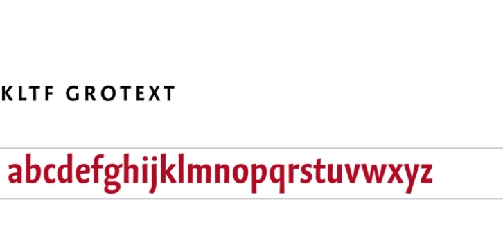
This is not one of the polished sanserifs. Grotext preserves a human touch. And history. While most contemporary typefaces assimilate uppercase and lowercase, Grotext emphasizes the difference between them. Its uppercase are wide and of classical proportions. Its lowercase are narrow and make it a space-saver. This is reminiscent of blackletter lowercase combined with uncial uppercase forms.
With help of four stylistic set features, Grotext can change its appearance. Alternates of a g h m n u give it a more robust character. Alternate schoolbook a d g l allow text to look simplified and more technical.
Under the hood, Grotext premières automatic spacing of uppercase letters in all caps context. It is one of the first Latin script OpenType fonts which make extensive use of contextual positioning.
The Compact package including the styles UltraLight, Light, Regular and Bold.

