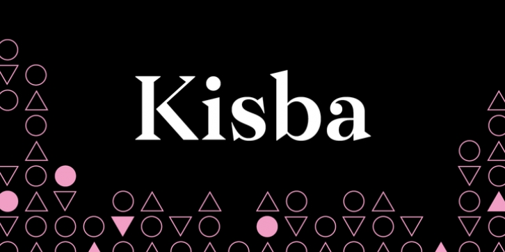
Kisba was designed by Moritz Kleinsorge and published by Moritz Kleinsorge. Kisba contains 7 styles and family package options.
Kisba is a brand new serif typeface that operates to arouse attention. As contrasts are known to attract each other, Kisba combines sharp, triangular serifs and spiky outgoing strokes with round and soft ball terminals. It’s a typeface driven by visual contrast.
Kisba‘s extraordinary design of thin and monolinear diacritics, selected punctuation marks and symbols creates a modern and elegant atmosphere. With extravagant letters like the f, k and x, Kisba is primarily labeled as a typeface for display usage or shorter texts, that catches the reader’s eyes.
The typeface exists in seven weights from Thin to Black offering plenty of possibilities to set texts and headlines. With about 600 Characters per weight, Kisba contains Open Type Features like an extended set of ligatures and language support, case sensitive forms, different sets of figures and arrows.
As a perfect companion to Kisba, my geometric Sans Serif Flink owns the same cap height. That way, you can set uppercase letters next to each other very easily.

