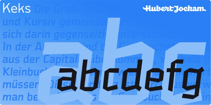
Keks was designed by Hubert Jocham and published by Hubert Jocham Type. Keks contains 7 styles and family package options.
And now something completely different. Keks has broken elements like a blackletter typeface, but the actual forms are roman. That keeps it very legible although there is no curve at all.
What was the inspiration for designing the font? Blackletter has an interesting history here in Germany. We need to find contemporary interpretations for this tradition.
What are its main characteristics and features? Legible roman blackletter
Usage recommendations: any usage that needs a black letter athmosphere where legibility is important.

