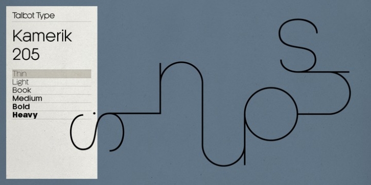
Kamerik 205 was designed by Adrian Talbot and published by Talbot Type. Kamerik 205 contains 12 styles and family package options.
Kamerik 205 is inspired by the classic, geometric sans-serifs such as Futura and Avant Garde, but has shallower ascenders and descenders for a more compact look, and features a traditional double-storey lower case a and g. It’s a versatile, modern sans, highly legible as a text font and with a clean, elegant look as a display font at larger sizes.
It includes old style non-aligning (lower case) numbers, both proportional and tabular as well as accented characters for Central European languages.
The Kamerik 205 family comprises of six weights, and is closely related to Kamerik 105. The most notable differences between the two variations, are the two-storey lower case a and g in Kamerik 205, where they are single-storey in Kamerik 105.

