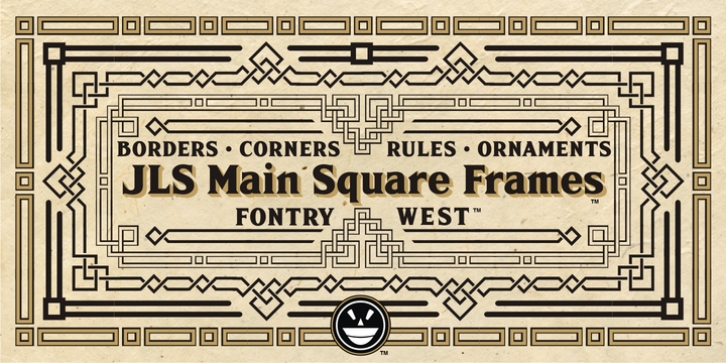
JLS Main Square Frames was designed by James Stirling and published by Fontry West. JLS Main Square Frames contains 5 styles and family package options.
In a small house, in a Mid-Western town, a single light trickled over the hardwood floors. A figure hunched over the light almost asleep. A poor designer of glyphs and symbols was working into the quiet hours of night. This night’s task was to create online promotional posters for his latest font – FHA Sign Devinne. The tortured creative’s mind stared at the blazing empty screen. Painfully, letters were typed, textures added, designs cobbled together – and failed. Something was missing. A thought dawned through the shadows of his overworked brain. He realized that lately his posters had become predictable. They were often embellished with borders and ornaments of a stylized floral theme created from samples of late 19th century signs. For Devinne, the virtuoso of vectors wanted something authentically vintage but with contemporary application. For inspiration, he grazed through his battered copy of an American Type Founders catalogue. The book was a gem he had picked up at an odds and ends shop for a buck. In it’s tattered and yellowed pages were several possible borders and ornaments. The one that he chose to complement the bold strokes of Sign Devinne was Mercantile Borders. As the work progressed, the basic forms offered by Mercantile were expanded, first by the needs of the posters, then by a few sign jobs (for that was his day job) that seemed to call for borders of that nature. In the fullness of time and other cliches, more samples and specimens came to the intrepid illustrators attention. After a month of doodles, signs and posters he realized that he had an entire alphabet – so to speak. The lovely and talented wife of the artist named the new project Main Square Frames.
Main Square Frames is a font of corners, rules and terminals. These can be combined in a range of configurations. The ‘weights’ and forms can be stand alone or some can be combined in layers. Main Square gets its character from forms over a century old. However, it is timeless for formal and conservative design such as business logos, letterheads and other commercial communication. Main Square is ideal for official looking documents, formal invitations, etc. It will enhance any graphic media but with the bold lines is great for signs, posters and displays. Even if the project is wild and flamboyant the formal character of Main Square Frames makes a great counterpoint, a frame for the design to break out from.

