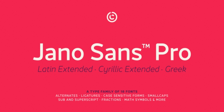
Jano Sans™ Pro was designed by João Cracel and published by Craceltype. Jano Sans™ Pro contains 18 styles and family package options.
Jano Sans Pro is a neo humanist sans serif that was initially created to be used as a text and display typeface in brand communication. The result is a type family with a relatable character and a collaborative profile. Designed with elegant forms, low contrast and a geometric feel, Jano Sans Pro is a highly legible typeface suited for any text application and typographic reproduction.
Jano Sans Pro has 18 styles and its a workhorse type system. It covers 290+ languages, including Extended Latin, Cyrillic and Greek writing systems. With over 1800 glyphs per style, its Opentype features include alternative shapes, small caps, standard and discretionary ligatures, localized forms in Latin and Cyrillic, case sensitive forms, numerators and denominators, proportional and tabular figures, slashed zero, fractions and more.
The techie personality and the huge set of features and glyphs makes Jano Sans Pro an excellent choice for a wide range of applications, such as branding, editorial, web and broadcast.

