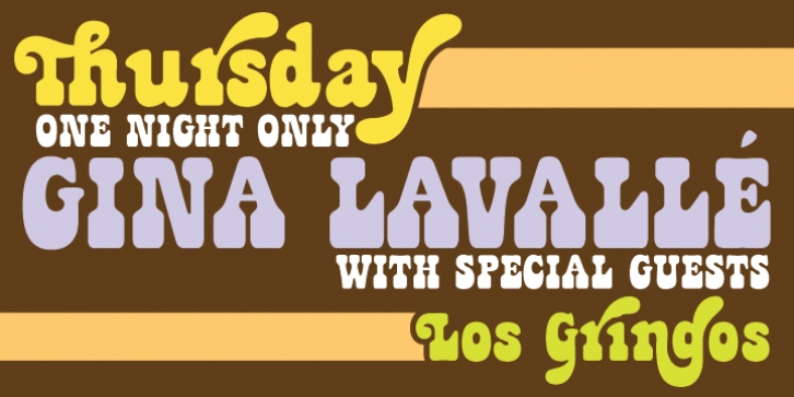
Jackpot was designed by Patrick Griffin and published by Canada Type. Jackpot contains 4 styles and family package options.
What happens when you mix a groovy hippy font idea (like Canada Type’s Janice for instance) with a Western concept such as Playbill? You end up with a groovy hippy western font, of course!
The idea is not new. It was quite common, but hardly ever used, in film type in the 1960s and 1970s. It is however, as far as we can tell, unique to digital type.
The idea for Jackpot came from a photo type called Cooper Playbill, which as the name implies was simply a westernized version of Cooper Black. It is strange that the font designers of the 1980s and 1990s never found the attraction of such a concept. We think it’s simply marvelous and quite ideal for communicating special great American times and ideas.
The recipe was simple: Follow Mr. Cooper’s big fat hippy idea, cowboy it with heavy slabs, give it true italics, then swash away at both for beautiful mixture. And there you have the bridge between groovy and all-American. There you have the country lover shaking hands with the rock and roll enthusiast. There you have your perfect substitute for the very overused Cooper Black.
We like to think of Jackpot as ‘free love with a holster’. Please don’t ask us what this means. We could hardly explain it to ourselves. Eight year old Benjamin thought the swashes we made looked very ‘sweeping’, like someone using a broom, so we called them Jackpot Sweep instead of Jackpot Swash. Benjamin approves, we’re hoping.
The Jackpot family is ideal for posters, signage, book covers, magazine ads, and plenty of other applications. If you’re creative and know how to use your imagination, you have just hit the Jackpot with this font family. Open Type enthusiasts should be very happy to know that the OT version of Jackpot comes in two fully-featured fonts, where the sweeps, alternates, ligatures, etcetera are stashed away in features for activation at the click of a button.

