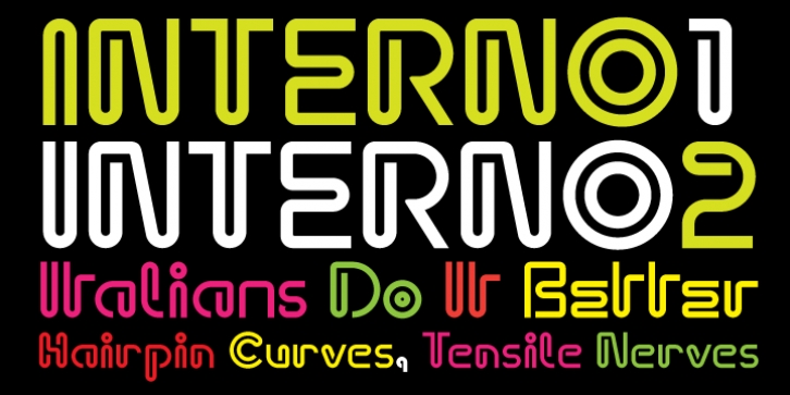
Interno was designed by Ian Lynam, Eli Carrico and published by Wordshape. Interno contains 2 styles and family package options.
Interno is a headline typeface built from a Walter Ballmer Olivetti logo exploration drawn sometime in 1960. Work on Interno commenced in 2006, but was soon abandoned. In 2009, Eli Carrico picked it up and ran with it, completing Interno 1. Ian Lynam picked through Eli’s development stages of the typeface and edited together a slightly different version, Interno 2, utilizing a mix of development characters and original characters.
Interno is Italian for internal (or at least that is what the translation widget told us). A great deal of the classic Olivetti design was down in-house (i.e. internal). Also, the typeface has internal switchbacks reminiscent of a paperclip. Interno sounds a bit like ‘turning inside’ phonetically(In-Turn-O). Additionally, Interno takes the first letter and last letter of Olivetti and flips it.
What was the inspiration for designing the font? It was built from a Walter Ballmer Olivetti logo exploration drawn sometime in 1960
What are its main characteristics and features? It is a highly contemporary display font that bends in on itself, evoking classic Italian modern graphic design.
Usage recommendations: Display type for use in editorial, packaging, and any other type of project that needs some Italian flavor.

