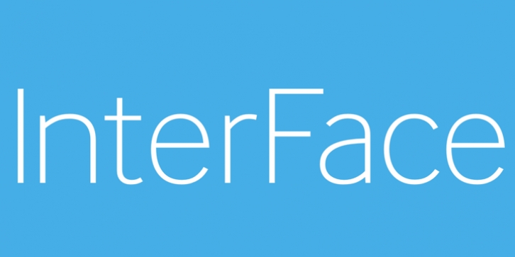
InterFace was designed by Bruno Maag, Naïma Ben Ayed and published by Dalton Maag. InterFace contains 12 styles and family package options.
The design of InterFace is influenced by the sans serif fonts of the late 19th Century. While many of the features are Grotesque, a softer look is achieved by blending in some humanist features, such as how the curved strokes meet the straight stems. The fractionally raised x-height allows for a slightly narrower design to increase the letter count where space is at a premium. InterFace‘s highly individual design features on some characters support a unique look, which helps a brand or identity stand out from the crowd.
This Font is the official typeface of the UK’s famous Southeastern Rail service. It is used in all of their marketing, signs & logo.
The Standard Edition includes a complete Latin A Extended character set. Please see the Corporate Edition of the font for an extended character set with Greek and Cyrillic scripts.

