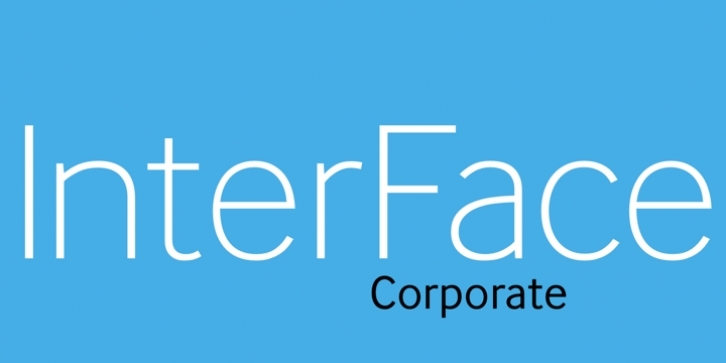
The design of InterFace is influenced by the sans serif fonts of the late 19th Century. While many of the features are Grotesque, a softer look is achieved by blending in some humanist features, such as how the curved strokes meet the straight stems. The fractionally raised x-height allows for a slightly narrower design to increase the letter count where space is at a premium. InterFace’s highly individual design features on some characters support a unique look which helps a brand or identity stand out from the crowd.
The Corporate edition of the InterFace font family has an extended character set which supports languages using Latin, Greek and Cyrillic scripts, meaning that InterFace can help you communicate with more than 2 billion people. Although all the alphabets are unified in design, each script system’s rich history and culture has not been tampered with, ensuring that native readers are happy to be spoken to in InterFace. A Standard Edition is also available.

