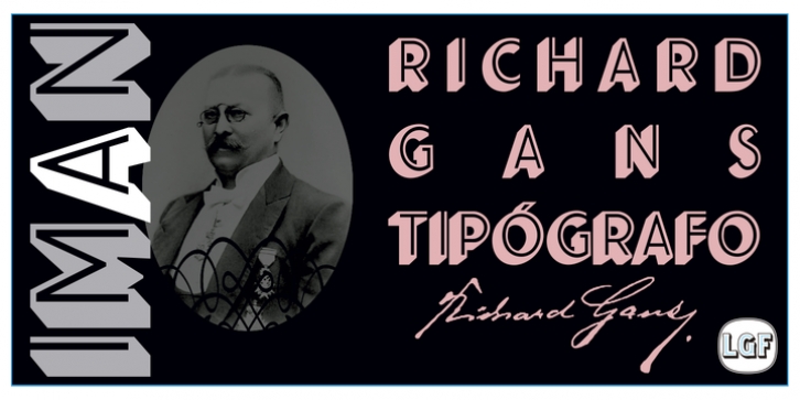
IMAN RG was designed by Manuel Lage and published by LGF Fonts. IMAN RG contains 1 style.
This type of Richard Gans, has always seemed very striking, despite having the complexity of the sources extrusion, has its own personality, and readability unusual for this type of letters. Use it for composing posters, programs or logos was very common at the time.
My father, Antonio Lage Parapar, typographer by profession, who composed the texts, which not only had it for profession, but he liked to do, always he spoke of sources and decorative elements of the type foundry Richard Gans, as well as other foundries, especially those that required the mender of them, exercised creator, many of these types they have already been recovered by professionals and companies with excellent results.
I’ve been surrounded by these movable type, and the occasional catalog unfortunately lost.
One of those guys that has always struck me visually speaking was the type IMAN Richard Gans, the typographer and more of German origin arrived in Spain, back in 1874, also a pioneer.
This work to revive the type mentioned, as well as create non existing glyphs between documents and parts I’ve been finding, is and has been a personal pleasure all I want serve as a tribute to my father (of aopodo curiously ‘Richard’), the only sadness it has not been completed.
Richard Gans, arrived in Spain in 1874 as a representative of several European factories.
then liaised with journalistic and publishing companies, which led him knowledge required of the first sector art. In 1878 he created a center importer gadgets graphic arts and three years later he created his own type foundry.
The first rotary newspaper ABC, very famous and the most advanced of the time, the brand manufactured Richard Gans.

