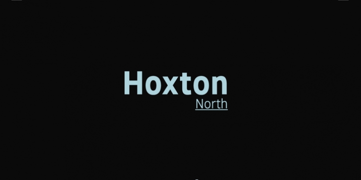
Hoxton North was designed by Jonathan Hill and published by The Northern Block Ltd. Hoxton North contains 12 styles and family package options.
Hoxton North came out of the concept to create something distinctly British, drawing on modernist influences such as Edward Johnston’s typeface for the London Underground and Gill Sans.
A humanistic san serif typeface with a British modern quality. Open forms with subtle contrast promote good readability across a wide range of media in both print and screen. The compact letterforms give it a strong lateral dynamic that is space efficient across design layouts. Details include 620 characters, seven weights with true italics, small caps, manually edited kerning and Opentype features.

