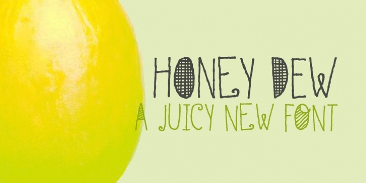
Honey Dew was designed by David Kerkhoff and published by Hanoded. Honey Dew contains 2 styles and family package options.
Right now it is melon time: the supermarkets are full of them: Galia, Honey Dew, Piel de Sapo… Back in Casa Hanoded we’re quite happy with the abundance of melons! So, when I created this cute little font, naming it was easy. Honey Dew is a shaky all caps font with different upper and lower case glyphs. I created alternate letters for both upper and lower case closed glyphs (like a, b, d, o, etc.) – including their accented brethren (aacute, abreve, acircumflex), etc. There is an alternate & and @, plus the Æ, Å’, Ø, æ, Å“, ø, þ and Þ. You should have guessed by now that Honey Dew comes with a whole stack of diacritics.

