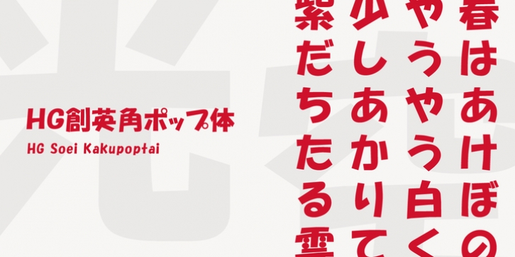
HG Soei Kakupoptai was published by RICOH. HG Soei Kakupoptai contains 1 style.
HG創英角ãƒãƒƒãƒ—体ã¯ã€æ°´æœ¬æµåæ°ãŒãƒ‡ã‚¶ã‚¤ãƒ³ã—ãŸã€Œå‰µè‹±ãƒãƒƒãƒ—体1ã€ã‚’å—æ¯ã¨ã™ã‚‹æ›¸ä½“ã§ã™ã€‚店é 広告用文å—ã®ã‚¹ã‚¿ã‚¤ãƒ«ã‚’模ã—ã¦ä½œã‚‰ã‚ŒãŸæ›¸ä½“ã§ã€æ¥½ã—ãã€è»½å¿«ãªæ›¸ä½“ã§ã™ã€‚極太角ゴシックã®ã‚¤ãƒ¡ãƒ¼ã‚¸ã‚’ベースã«ä½œã‚‰ã‚Œã¦ã„ã¾ã™ãŒã€ãれをやや崩ã—ã€æŸ”らã‹ã•ã‚‚å–り入れã€ãƒ•ãƒªãƒ¼ãƒãƒ³ãƒ‰ã§æ›¸ã„ãŸã‚¤ãƒ¡ãƒ¼ã‚¸ã‚’残ã—ã¦ã„ã¾ã™ã€‚見やã™ãã™ã‚‹ãŸã‚ã€ãµã¨ã“ã‚ã¯å¯èƒ½ãªé™ã‚Šå¤§ãããªã£ã¦ã„ã¾ã™ã€‚店é ã®POPã€ãƒãƒ©ã‚·ã€çœ‹æ¿ãªã©ã«æœ€é©ã®æ›¸ä½“ã§ã™ã€‚
HG Soei Kakupoptai is a typeface with a ‘fresh pop’ designed by Mr. Mizumoto Keiko. It is a typeface made by mimicing the style of letters for party-style, fun and light typefaces. It is made on the basis of the image of thickSoei Kakugothic, but it breaks it open, and incorporates softness, leaving the font looking freehand. To make it easy to see, the boldness has become as thick as possible. It is a typeface best suited for store-front fun, leaflets, signboards and so on.

