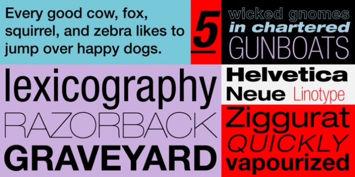
Helvetica grew in popularity throughout the 1960s and 1970s, and more versions of the family were introduced. This led to vast confusion: the same weight is often referred to by two different names, design features often vary from one face to another, and so on.
In the early 1980s, Linotype remedied this situation by redrawing the entire Helvetica family. Differences in alignment were corrected, subtle features were made consistent from one face to another, and all the weights and widths were designed to work together as one family.
This new drawing is called Neue Helvetica (German for New Helvetica), and incorporates an easy-to-use numbering system to identify various styles and weights.

