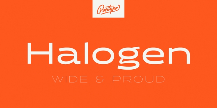
Halogen was designed by Neil Summerour and published by Positype. Halogen contains 14 styles and family package options.
Who doesn’t want or need an expansive contemporary extended sans that has a sense of style and swagger… what if it had a lowercase, small caps and various numeral options… how could you say no? This was the foundational argument I made for myself when I drew the initial alphabet on my birthday last year (something I do each year, draw a new font, kind of a fun OCD thing). I wanted to see a wide, utilitarian sans that had more to it than just a basic character set and didn’t resemble standard geometric models. As I continued sketching, the letterforms were being influenced more by my ‘lettering tendencies’ than the normal mechanical trappings of drawing flat, wide letters. The letters have retained aspects of letters created by hand – stresses, modulation, naturally ending terminals. Truncation and quick clipping of strokes became antithetical to the letterforms I drew, so I continued this once I brought the design into the computer. I kept it precise and dependable, but made every attempt to keep a conscientiously crafted typeface and not let it devolve into a grid-based drone. As such, it works just as well looking back in time as much as it does assuming a lead role in a sci-fi movie.
Halogen does deliver and opts not to take a short cut and provide an anemic offering of glyphs – a modern typeface offered today must provide more than just the basics and this one does – lowercase, smallcaps, old style numerals, tabular forms, stylistic and titling alternates, fractions, case-sensitive features, and even an alternate uppercase ordinal set is included. So go make cool print and digital things with it, now.

